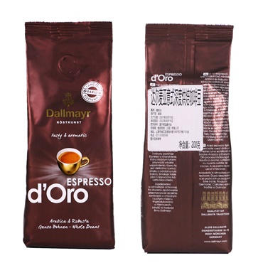
Today I would like to talk about a detail which we see everyday but often be underestimated: The colour of coffee packaging bags.
About the coffee industry, I have deeply realized that a consumer’s first impression is often not derived from the flavor or the story of origin but from the color of the coffee packaging. That particular color on the packaging bag may determine whether a consumer picks it up even before you get a chance to say, “This arabica beans are a sun-dried baby from a micro-lot at an altitude of 1850 meters.”
Recently, we have conducted a survey among over 200 American coffee drinkers, and the results were quite interesting. Participants viewed images of coffee bags in various colors,from pink, yellow, green to brown, black, blue, and white,and then told us their expectations regarding flavor, mouthfeel, aroma, and their perception of the brand’s tone. The results confirmed our long-held ideas: color truly does “speak.”
For example, pink? Almost everyone’s first reaction was “sweet,” “fruity,” and “floral.” This is not coincidental but rather a result of long-term consumer culture background. They think strawberry-flavored candies or peach tea. Pink is the visual code for “sweet flavors.” Therefore, if you have a bean with strong fermentation and berry-like characteristics processed using pink or light pink as the primary color will make consumers mentally “taste” that sweetness before they even take a sip.
Similarly, yellow and bright green directly reflect these notes, bright acidity, and even a freshness reminiscent of matcha. These colors are particularly suitable for Ethiopian washed beans or Kenyan beans with tomato-like acidity and berry undertones. On the other hand, dark brown and black naturally suggest deep roasted, chocolate, caramel, and even a hint of bitterness. This appeals to espresso blend lovers but may give rise to misconceptions like being “too heavy” for those who prefer clean and bright light roasts.
Interestingly, saturation also plays a crucial role. The more intense and vivid the color, the more consumers expect “stronger” flavors and higher bitterness, high roasted levels, and a heavier mouthfeel. However, such coffee packaging often scores lower in overall preference. Why? Because today’s common coffee consumers, especially younger ones, prefer balanced, sweet, and floral-fruity notes. They find “too dark, too heavy” packaging reminiscent of commercial beans, lacking the “specialty” touch.
We found that white, light pink, light blue, and low-saturation pastel shades are more popular. These colors convey a sense of “cleanliness,” “refinement,” and “modernity.” Particularly, light blue is often associated with “premium quality,” “minimalist design,” and even “cold brew flavors.” Green almost directly means “organic,” “sustainable,” and “eco-friendly” which is perfect for emphasizing ecological cultivation and rainforest certification.
You might ask, what about traditional brown bags? There is still a market for them, especially among older consumers who trust brown as “the real deal.” But be aware, brown can be also linked associations with “commercial beans” or “supermarket beans.” Unless your design is sophisticated enough, it’s challenging to escape the “mass-market” label.
Therefore, my advice to roasters and brands is the following that choosing coffee packaging color is not just about picking something visually appealing; it’s about strategic communication.
Before designing labels, you must answer two critical questions:
What are the flavor characteristics of this coffee?
If it has floral and fruity acidity, the coffee packaging should avoid deep browns and blacks. For chocolate and nutty espresso blends, pastel pinks aren’t suitable either. Colors should align with flavor expectations. Otherwise, when consumers taste the coffee and find it different from what they expected, trust is broken.
What brand concept do you want to convey?
Is it “organic sustainability”? Use green. Is it “modern innovation”? Pink, yellow, and blue are all options. Is it “premium refinement”? Try low-saturation Morandi tones. Is it “classic reliability”? Deep brown can work, but the design language must be high-quality.
Ultimately, color is not merely an aesthetic choice; it is the gateway to the consumer’s mind. Especially in online sales and shelf displays where first impressions matter most. A color that accurately reflects flavor expectations and brand tones could be the key to standing out among rows of coffee bags.
For producers from origin countries, exporters, and roasters, this is not just a design issue but a strategy for value expression. Through color, we can more precisely connect with our target customers and tell them the story of the beans, and even establish dominance in niche markets.
So, next time you design new coffee packaging, don’t just ask, “Is this color pretty?” Instead, ask, “Does this color allow consumers to ‘taste’ the flavors which I want to express?”
This is the true power of coffee packaging color in the age of specialty coffee.


